
Five design items checked today. The How&How rebrand, Swiss Post Sans, the Toyto and Purple Garden identities and the INTL poster competition, each checked at the source.
These are the five design items checked today: one studio rebrand, a new typeface for the Swiss postal service, two brand identity cases and news from a poster competition. Each was opened at the source to confirm the date and content.
| HOW+HOW rebrand | November 2 | A studio changes its name and logo |
| Swiss Post Sans | Date not stated | A new typeface for Swiss Post |
| Toyto identity | November 2 | A new face for a wooden-block toy brand |
| INTL poster competition | November 2 | This year's entries and trends |
| Purple Garden rebrand | October 28 | An identity that began with a séance |
- Creative BoomHOW+HOW rebrand (opens in a new tab)A London and LA studio's new name and logo
- It's Nice ThatToyto × Odd Works (opens in a new tab)The identity of a wooden-block toy brand
- Creative BoomPurple Garden × Mother Design (opens in a new tab)An identity that started with a séance
HOW+HOW (November 2). The London and LA design studio How&How is now HOW+HOW. The ampersand became a plus sign, and the lowercase name moved to capitals. The logo is a geometric mark that looks like an analogue volume dial, and it can stretch into a long bar like a mixing-desk fader. The idea is "Turn up your truth". The website was rebuilt too, written so that AI search as well as Google can read it. The studio launched in 2020, so this comes six years in.
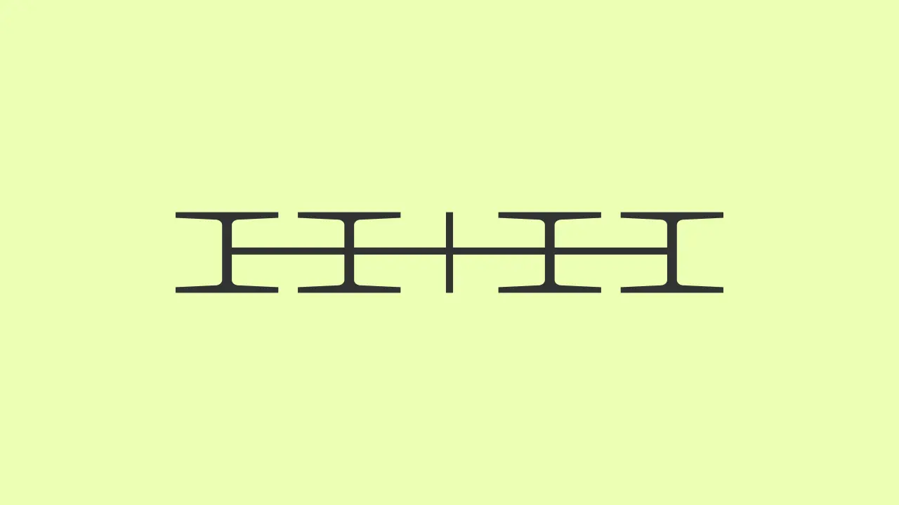
Image: Creative Boom
Toyto × Odd Works (November 2). Odd Works, a studio working between Lisbon and London, designed the identity for Toyto, a Berlin brand of wooden block toys. The wordmark is built from shapes that echo the toys and is paired with Labil Grotesk by Kometa Typeface. The packaging is clean, with embossing and debossing for touch. It names Bauhaus designers and Dieter Rams among its influences. A brand that wants children to hold wood instead of a screen skipping loud toy colours is a pretty easy choice to follow.
Purple Garden × Mother Design (October 28). The rebrand of the psychic services platform Purple Garden was done by the London studio Mother Design. The process is unusual. The team held a séance, a chakra reading and an automatic drawing workshop, and worked in paper and charcoal. The result is a wordmark with elongated serifs, a crystal-like glyph, a palette of six warmer purples and 28 botanical and abstract motifs. The idea behind it, "A Living Practice", moves the brand from one-off readings to ongoing practice.
- Purple palette6colors
warmer purples
- Illustrated motifs28
botanical and abstract
Swiss Post Sans. Swiss Typefaces made this custom typeface for Swiss Post. The page says the project took more than three years, and it gives no launch date, so none is stated here. The standout constraint was a "Hard Switch": the new font had to replace the old one by swapping font files, with no change to existing designs or layouts. That meant keeping the typographic volume of the original. There are five weights, Light, Regular, Bold, Black and ExtraBlack, and an Italic that is drawn with cursive qualities instead of a slanted Upright. Because prices and timetables are full of numbers, numerals are tabular by default. The square dot became round.
INTL International Poster Competition (November 2). The competition launched in 2014. This year it drew 2,670 entries from 78 countries, and 190 posters go on show. Co-founder James Gilchrist says the purpose of a poster has stayed the same for centuries, to publicise and persuade. What changed is that QR codes and links let a poster carry less information, so designers can be more artistic. He points to three trends in this year's selection: dense layering that turns the image into a surface, collaged 90s-style typography, and deliberately "unprofessional" naive, analogue work.
- Entries2,670entries
in 2026
- Countries78countries
where entries came from
- Posters on show190posters
by more than 200 designers
Laid side by side, the five share a thread. Logos and typefaces seem to be designed less around what they hold and more around how they get swapped in. A logo that stretches like a volume dial and a font that replaces another by file are both that. I would bet on the Toyto way, taking things away, lasting longer, but that is a matter of taste. Whether the AI-search tuning of HOW+HOW works in practice is not in the article, so it cannot be known from here.
- How&How becomes How+How in a rebrand that turns up its truth, Creative Boom
- Swiss Post Sans, Swiss Typefaces
- Children's toys don't need to be an eyesore with Odd Works' tasteful identity for Toyto, It's Nice That
- "Designing a good poster is a dark art": highlights from this year's INTL poster competition, It's Nice That
- Mother Design began Purple Garden's rebrand with a séance, Creative Boom